How to Draw Hair in Fashion Illustration: Volume, Flow, and Shine
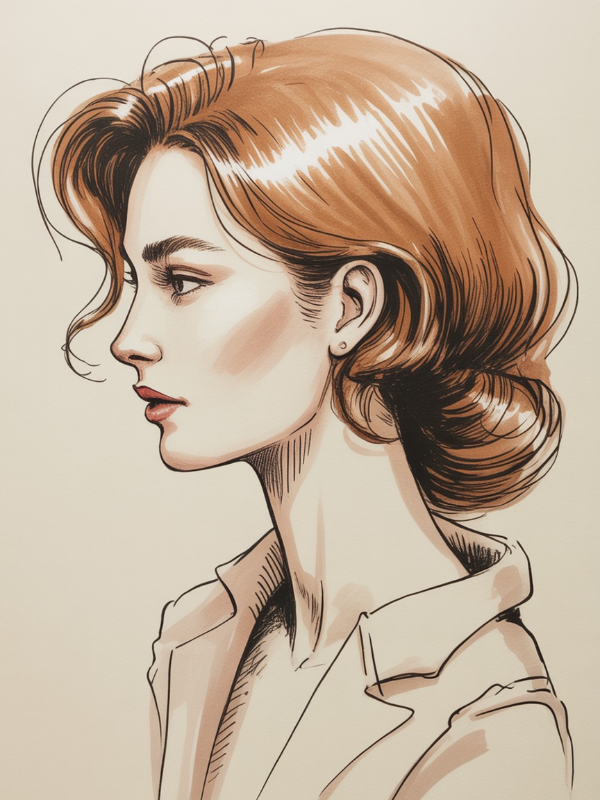
Hair is the part of a fashion illustration most artists either rush through or overwork. Rush it, and you get a flat helmet shape with a few lines scratched on top. Overwork it, and you get a frizzy tangle where every single strand is fighting for attention and the drawing loses all sense of light. Good illustrated hair does neither. It reads as a single moving mass with a clear direction, and it lets two or three well-placed lines do the work that fifty scattered ones cannot.
Like the rest of a croquis, hair follows rules you can learn and repeat. Once you understand how to block volume, map direction, and render in just three values, hair stops being the part of the drawing you dread and becomes one of the fastest, most expressive parts of the page.
Start With the Mass, Not the Strands
Before a single hair line touches the page, block in the overall shape as a simple solid volume, the same way you would block in a sleeve or a skirt before adding fabric folds. Think of hair as a soft, rounded form sitting on top of and around the skull, not as a surface texture painted directly onto the head.
Ask yourself three questions before you draw a single strand:
- Where does the mass sit relative to the skull? Hair adds width and height beyond the head's actual bone structure. Draw the skull shape lightly first, then let the hair volume extend past it, especially at the crown and through the ends.
- What is the overall silhouette? Squint at your reference or your mental image until the individual strands blur away. What is left, a soft round bob, a long tapered column, a wide voluminous cloud, is the shape you block in first.
- Where does the mass end? Decide the endpoint of the hair before you render a single strand inside it. Loose, undefined edges are one of the fastest ways to make hair look unfinished.
Once that outer volume is blocked in pencil, everything you add inside it, part lines, strand clusters, flyaways, is detail happening inside a shape you have already committed to. That order keeps hair from sprawling outside its own silhouette as you add detail, which is the single most common beginner mistake.
The Direction Map: Hair Moves as Groups, Not Individual Strands
The habit that separates confident illustrated hair from stiff, wiry hair is thinking in direction groups instead of individual strands. Real hair does not move as thousands of independent lines. It moves as clusters, sections that bend, twist, and catch light together because they are physically next to each other.
Before rendering, lightly sketch a "direction map": a handful of long, sweeping guide lines that show where each major section of hair is traveling. A center or side part is your anchor point, and every guide line radiates outward from it, following gravity, a hairstyle's shape, or movement from wind or motion in the pose. Three to six guide lines are usually enough to describe an entire head of hair.
When you add your actual ink or final strand lines, follow those guides closely but vary the spacing and thickness between them. Perfectly even, parallel strands read as a wig. Strands that cluster in some places and separate in others, still following the same overall direction, read as movement and life. This is the same principle behind rendering fabric folds and drape: a few confident lines following a clear direction beat dozens of uncertain ones.
Three-Value Rendering: Base, Shadow, Shine
Hair reads as dimensional through the same value logic used for polished leather or metal hardware. You do not need to render every strand in a different shade. You need exactly three values, applied in the right order.
- Base tone first. Lay down the overall hair color as a flat, even mid-tone across the whole mass. Leave no white paper showing yet, even in areas that will eventually catch light.
- Shadow beneath the shape. Add a darker value wherever hair recedes from the light source: underneath the crown, behind the ear, along the underside of a ponytail or braid, and wherever one section of hair overlaps and shadows another.
- One shine streak, added last. Reserve a single bright, elongated highlight following the curve of the head, usually running from the crown diagonally toward one side. This is the same sharp-edge-against-soft-shadow principle covered in our guide to rendering shine on metal and leather accessories, and it works because hair is glossy in exactly the same way polished leather is.
The shine streak is doing almost all of the work of making hair look glossy and three-dimensional, so protect it. Keep its edges relatively clean rather than blending it fully into the base tone, and never split it into two or three competing highlights. One confident streak of light beats several scattered ones, every time.
Texture Rules: Straight, Wavy, Curly, and Coily Hair
The volume-and-direction approach above applies to every hair texture, but the shapes inside that direction map change with texture. Treating all hair as if it were straight is a common way illustrations end up feeling generic or excluding an entire range of real hairstyles.
- Straight hair follows long, mostly unbroken guide lines with minimal waviness. The shine streak can run long and continuous, since there is little interruption to break up the reflected light.
- Wavy hair follows the same guide lines but with a gentle, repeating S-curve built into each strand cluster. Keep the wave rhythm consistent within a single section rather than making every strand wave differently, or the hair will look chaotic instead of textured.
- Curly hair is built from overlapping C and S shaped clusters rather than long lines. Block the overall volume larger and rounder than you might expect, since curls occupy more space than straight hair of the same length, and let individual curl clusters overlap each other at their edges rather than sitting side by side with visible gaps.
- Coily hair holds the most volume of any texture and is built from small, tight zigzag or spiral clusters grouped into larger sections. Render the shine streak in shorter, more broken segments rather than one continuous sweep, since the tighter coil pattern breaks up reflected light into smaller catches rather than one long streak.
Whatever the texture, the same three steps apply: block the mass, map the direction in clusters, then render in three values. Only the shape of the clusters changes.
Edges: Structured Silhouette vs. Loose Flyaways
The edge of a hair mass tells the viewer what kind of illustration they are looking at. A clean, unbroken silhouette edge reads as graphic and editorial, the kind of confident shape you see in a fashion sketch meant to sell a strong overall look. A silhouette broken up with a few loose flyaway strands escaping the main mass reads as soft, natural, and a little more realistic.
Neither approach is more correct than the other, but mixing them without intention muddies a drawing. Decide early which effect you want. For a bold, poster-style croquis, keep the outer edge clean and save any flyaways for one or two deliberate strokes at most. For a softer, more painterly illustration, add flyaways more generously, but keep them concentrated near the crown and the ends, where hair naturally escapes a style, rather than scattering them evenly around the whole shape.
Updos, Braids, and Ponytails
Gathered hairstyles follow the exact same three-step process, just with an added constraint: a visible point where the hair is bound. Draw that anchor point, a hair tie, pin, or the top of a braid, before anything else. It is the one fixed point everything else radiates from or hangs from, the same way a belt anchors the drape of a skirt.
For a ponytail, the direction map becomes simple: nearly every guide line points away from the anchor point, curving with gravity as it falls. For a braid, block the whole braid first as one continuous rope-like volume, then add the interlocking pattern on top as surface detail, the same way you would add a herringbone weave onto a coat only after the coat's silhouette is settled. For an updo, treat each twisted or pinned section as its own smaller volume with its own direction map, then unify the whole thing with a single shared shadow value where sections overlap.
Common Mistakes to Avoid
- Drawing strands before blocking volume. This is the single most common cause of hair that looks flat or disconnected from the head. Volume first, always.
- Perfectly even, parallel strand lines. Real hair clusters unevenly. Vary the spacing and thickness of your lines or the hair will read as a wig.
- Multiple competing highlights. One shine streak beats five scattered ones. If the hair looks busy, remove highlights until only the strongest one is left.
- Hair that ignores gravity or motion. Every guide line should have a reason for the direction it travels, whether that reason is gravity, wind, or the swing of a turning pose.
- Treating every texture as straight hair. Curly and coily hair need larger, rounder blocked volumes and cluster-based rendering, not long straight guide lines rendered smaller.
Practice Approach
Dedicate a sketchbook page to hair studies the same way you would to hands or shoes. Draw five or six simple oval "heads" with no faces, and practice nothing but blocking hair volume and direction maps on top of them, varying the texture and style each time. Because you are skipping the face entirely, you can fit a dozen studies on one page. If you want the anatomy underneath those studies to be accurate, our guide to drawing faces on fashion croquis covers the proportion grid the hairline sits on. That repetition builds the same fast, confident hand memory that flats and gesture drawing do, so that by the time hair goes onto a finished figure, you are recalling a pattern instead of solving it from scratch under time pressure.
Recommended Supplies for Drawing Hair
For Strand and Direction Linework
Sakura Pigma Micron Set (6 pens) gives you the fine 005 and 01 tips needed for confident direction lines without the strokes going heavy or uneven.
For Blending Base Tone and Shadow
Prismacolor Premier Colored Pencils (72-set) blend smoothly for the graduated shadow values that give hair its rounded, three-dimensional feel.
For Fast, Even Base Color
Copic Sketch Markers (72-color set) lay down the flat, even base tone hair rendering starts from, before pencil or ink detail goes on top.
For the Final Shine Streak
Sakura Gelly Roll White Pen lays a crisp, opaque highlight over ink or marker, exactly the sharp shine streak that sells glossy, healthy-looking hair.
Give Every Hairstyle a Figure Worth Framing
Our Fashion Croquis Template Sketchbook: Paris Edition gives you 300 pages of light grey 9-head figure templates with scenic Paris backgrounds. Block the volume, map the direction, and render the shine on a figure that is already posed and ready.
Get the Paris EditionSome links above are affiliate links. If you purchase through them, we may earn a small commission at no extra cost to you. We only recommend products we genuinely use or believe in.