Color Theory for Fashion Illustration: Building a Palette That Sells the Look
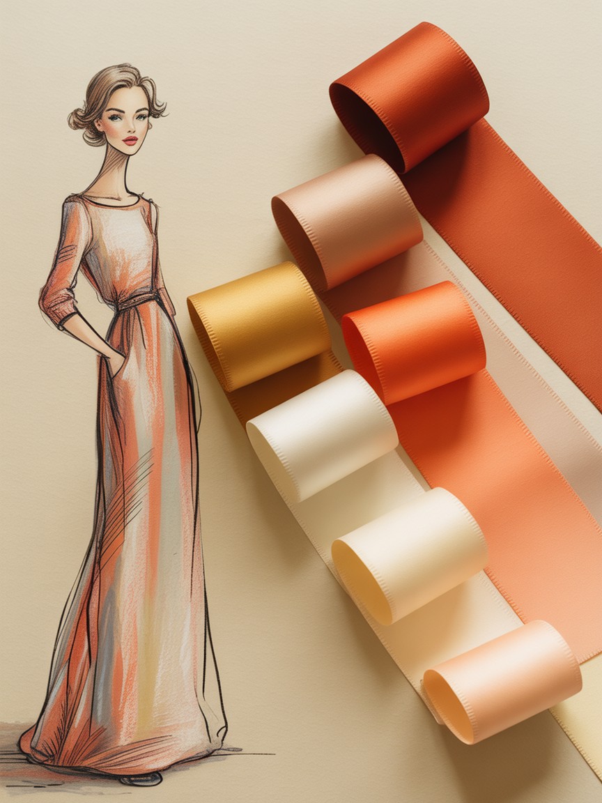
Ask a beginner why they chose a particular color for a garment and the honest answer is usually "it looked nice" or "that's the color the reference photo had." Ask a working fashion illustrator the same question and you get a plan: this hue supports the mood of the collection, this one repeats from the accessories to unify the page, this one exists purely to make the eye land on the waist first. Color in fashion illustration is not decoration added at the end. It is one of the first decisions that determines whether a drawing reads as intentional or accidental.
The good news is that you do not need a fine arts degree in color science to make confident choices. You need a handful of repeatable rules, a habit of testing value before hue, and the discipline to stop adding colors once a palette is doing its job. Here is how to build that habit.
What Color Is Actually Doing in a Fashion Illustration
Before picking a single hue, it helps to separate the three jobs color performs on a croquis, because they often get mixed together and muddy the result.
- Describing the garment. The most literal job: this coat is camel, this dress is emerald. Accuracy matters here, but accuracy alone does not make an illustration compelling.
- Setting the mood. A palette of dusty rose, cream, and warm grey reads as soft and romantic. The same silhouette in black, acid yellow, and cobalt reads as sharp and confrontational. Mood is often the real reason a client hires an illustrator instead of just photographing the garment.
- Directing the eye. Color contrast pulls attention. A single warm accent against a cool, muted figure will always win the eye first, whether that accent is a belt, a lip color, or a lining glimpsed at a cuff.
Every color choice on the page should be doing at least one of these three jobs on purpose. If you cannot say which job a color is performing, it is probably decoration, and decoration is exactly what makes a palette feel accidental instead of designed.
Three Palette Structures Every Illustrator Should Know
You do not need to memorize the full color wheel to work with intention. Three structures cover the vast majority of professional fashion illustration, and each produces a different mood.
Monochromatic: One Hue, Many Values
A monochromatic palette uses a single hue pushed through a range of values, from a pale tint near white to a deep shade near black, sometimes with a small shift in saturation along the way. Think of an all-camel look rendered from cream to deep chocolate, or an entirely emerald outfit moving from mint to forest. Monochromatic palettes read as sophisticated and editorial because nothing competes with the silhouette. They are also the most forgiving structure for a beginner, since there is no hue relationship to manage, only value.
Analogous: Neighbors on the Wheel
An analogous palette pulls two or three colors that sit next to each other on the color wheel, such as coral, warm pink, and gold, or teal, blue, and violet. These palettes feel cohesive and natural because the colors share an underlying temperature. This is the structure behind most of the "your figure looks like it belongs together" results, and it is the safest choice when you are illustrating a full outfit with more than one garment color.
Complementary Accent: One Loud Contrast
Rather than building an entire outfit from opposite colors on the wheel, the professional version of a complementary palette uses a mostly neutral or muted base, then adds one small, deliberate hit of the opposite hue: a red lip against a sage green coat, a cobalt clutch against a warm beige suit. This is the fastest way to direct the eye to a specific detail, and it is far more effective than making an entire garment loud, which tends to exhaust the viewer instead of guiding them.
Building a Palette From One Reference Swatch
The most reliable way to build a palette for a specific garment is to start from a single anchor color, usually the dominant fabric color from your reference, and build outward in a fixed order rather than guessing at four or five colors simultaneously.
- Anchor color. Pick the true color of the main garment. This is your loudest commitment and everything else is judged against it.
- Support color. Choose a second color, usually for a secondary garment piece or large background shape, that is either analogous to the anchor (same temperature, different hue) or a lighter and darker value of the anchor itself.
- Neutral. Add one neutral, a warm cream, a cool grey, or true black or white, to give the eye a place to rest between the anchor and support colors. Skin and hair values often serve this role automatically.
- Accent. Reserve one small, higher-contrast color for the single detail you most want noticed: a shoe, a lip, a bag, a lining. Use it in the smallest area of the drawing, never as a large shape, or it stops functioning as an accent.
Working in that order, anchor, then support, then neutral, then accent, keeps a four-color palette from turning into eight colors by accident, which is the single most common way a beginner's palette collapses into visual noise.
Value Before Hue: The Black and White Test
Here is the test that separates palettes that merely look pretty from palettes that actually work: convert your color choices to greyscale, either by squinting hard or by desaturating a reference photo of your palette, and check whether the composition still reads clearly.
If your anchor garment and your background sit at nearly the same grey value once the hue is removed, the illustration will feel flat no matter how well the colors were chosen, because the eye separates shapes by value long before it separates them by hue. This is the same value logic covered in our guide to three-value hair rendering: a base tone, a shadow, and a single highlight, applied at the level of the whole composition instead of just one feature. A palette with strong value contrast between figure and ground will read clearly even printed in black and white, which is exactly the standard a magazine tear sheet or a spec sheet needs to survive.
A fast way to build this habit: before you commit to final colors, do a five-minute thumbnail in plain grey marker or pencil first, blocking only light, mid, and dark shapes. Once that value map reads clearly on its own, color becomes the easy part, since you are only choosing hues to sit inside a structure that already works.
Skin Tone Undertones: Warm, Cool, and Neutral
Skin color is part of your palette, not separate from it, and it deserves the same intentional treatment as fabric. Every skin tone, regardless of depth, carries an undertone that is warm (leaning yellow, peach, or golden), cool (leaning pink, red, or blue), or neutral (a balanced mix of both).
Getting the undertone right matters more than getting the exact depth right, because a mismatched undertone is what makes rendered skin look chalky, muddy, or artificial, even when the value is correct. A practical approach for building your figure library:
- Test your undertone mix first, on scrap paper, before it touches the face. A warm base usually starts from a light ochre or peach, a cool base from a soft rose or violet-grey, and a neutral base from a balanced tan that leans in neither direction.
- Keep shadow colors in the same temperature family as the base. A warm skin tone gets warm shadows (burnt sienna, warm brown), not a cool grey dropped in from an unrelated part of your palette. Mixing temperatures in skin shadow is one of the fastest ways to make a face look unwell rather than dimensional.
- Let your garment palette and your skin tone speak to each other. A warm analogous outfit palette generally sits best against a warm skin undertone rendering, and the same is true for cool palettes, which keeps the whole figure feeling like one considered image rather than two separate decisions stapled together.
If you want the full proportion and rendering approach for the face itself before adding color, our guide to drawing hands and faces on fashion croquis covers the structure that skin tone sits on top of.
Fabric Changes the Same Color
The same red behaves differently on silk, denim, and wool, and a palette plan needs to account for that before you start rendering. Glossy fabrics like silk and satin push a color's highlight almost to white and its shadow almost to black, widening the value range dramatically even though the hue does not change. Matte fabrics like wool and cotton compress that range, sitting closer to the color's true mid-value throughout. Textured fabrics like denim or tweed break a single color into small value variations across the surface rather than one smooth gradient. Our guide to rendering fabric textures goes deeper on the technique side of this, but the color planning implication is simple: decide your fabric's finish before you decide how wide a value range that color needs in your palette.
The Discipline of a Limited Palette
Professional fashion illustration overwhelmingly favors three to five colors per piece, including the neutral and the accent. This is not a limitation forced by lack of skill. It is a deliberate choice, because a limited palette is what makes a figure look considered rather than like every marker in the set got tested on the same page.
When you feel the urge to add a sixth color, ask whether it is doing one of the three jobs from the start of this guide: describing, setting mood, or directing the eye. If the honest answer is "it just looked like it needed something," the fix is almost always to push an existing color further (a darker shadow, a brighter highlight) rather than introducing a new hue. A tight palette pushed hard reads as confident. A wide palette used timidly reads as unfinished, even when the drawing underneath is technically strong.
Common Color Mistakes to Avoid
- Choosing hue before value. Run the greyscale test first. A palette with weak value contrast never gets rescued by hue choice alone.
- Mismatched skin and shadow temperature. Warm base, warm shadow. Cool base, cool shadow. Crossing the two makes skin look unwell rather than dimensional.
- Treating every accent as equally important. One accent per figure. Two competing accents cancel each other out and the eye has nowhere confident to land.
- Ignoring fabric finish. The same red needs a wider value range on satin than on wool. Plan the range before you render.
- Adding color to fill silence instead of solving a problem. If a color is not describing, setting mood, or directing the eye, it is probably noise.
Practice Approach
Take one existing croquis you are happy with in line only, and render it three separate times on tracing paper or in three quick digital layers: once monochromatic, once analogous, and once with a single complementary accent on a mostly neutral base. Comparing the same linework under three different palette structures, side by side, teaches your eye the mood each structure produces far faster than reading about it does. Repeat with a new figure each week, rotating which color job (describing, mood, or eye direction) you deliberately prioritize, until choosing a palette on purpose feels as automatic as blocking proportion already does.
Recommended Supplies for Practicing Color Theory
For a Controlled, Repeatable Palette
Copic Sketch Markers (72-color set) use a numbered system, so once you find a warm analogous or accent trio that works, you can recreate the exact same palette on the next figure without guessing.
For Smooth Value Gradients Within a Hue
Prismacolor Premier Colored Pencils (72-set) blend cleanly across a value range, ideal for practicing monochromatic palettes where one hue has to carry a full light-to-dark gradient.
For Mixing Custom Undertones
HIMI Gouache (24-color set) mixes on the page, which makes it the fastest way to test warm, cool, and neutral skin undertones on scrap paper before committing color to a face.
For Luminous, Editorial Washes
Dr. Ph. Martin's Hydrus Liquid Watercolors produce the transparent, glowing color relationships that make an analogous or monochromatic palette feel elevated rather than flat.
Test Every Palette on a Figure That Is Ready to Go
Our Fashion Croquis Template Sketchbook: Paris Edition gives you 300 pages of light grey 9-head figure templates with scenic Paris backgrounds. Skip redrawing the proportion every time and spend your practice time where it counts: choosing the palette.
Get the Paris EditionSome links above are affiliate links. If you purchase through them, we may earn a small commission at no extra cost to you. We only recommend products we genuinely use or believe in.