Drawing Nature on the Runway: An Illustrator's Guide to AW26's Wildest Trend
Something unusual happened during AW26 fashion month. Across Paris, Milan, and London, designers collectively turned away from screens, algorithms, and the digital noise of modern life, and turned toward something ancient: the natural world. Moss covered the runway floors. Butterflies became a philosophy. Nature became the set, the concept, and sometimes the garment itself. For fashion illustrators, this nature-obsessed season offers a rich landscape of new subjects to draw, from botanical set design to iridescent fabric rendering.
This wasn't a single designer's whim. Multiple houses independently turned to nature as a theme, from set design to garment construction. The question for illustrators is practical: how do you translate living, breathing organic forms into the clean lines of a fashion croquis?
Let's break down the trend by what appeared on the runways, why it matters, and exactly how to draw it.
The Runways: What Actually Happened
Before we pick up our pencils, let's ground ourselves in what designers actually showed. All of the following is based on confirmed press coverage from the shows.
Chanel: Caterpillars by Day, Butterflies by Night
Matthieu Blazy's second ready-to-wear collection for Chanel was built around a quote from Gabrielle Chanel in Le Figaro: "We need dresses that crawl and dresses that fly, because the butterfly doesn't go to the market and the caterpillar doesn't go to the ball."
Blazy took this literally. As Vogue's Nicole Phelps reported, the collection began with "the simplest of black skirt suits" and "crescendoed in a series of iridescent looks made from printed chainmail and trompe l'oeil tweeds; function and fiction side-by-side." The set at the Grand Palais featured towering construction cranes glowing in primary colors, what Blazy described as "the idea of building a dream, a work in progress."
For illustrators, the key detail is the metamorphosis concept: the same figure rendered in muted neutrals for daywear, then transformed with iridescent surfaces and movement for evening. That transition is a powerful narrative device in a fashion illustration series.
Miu Miu: Moss and Meaning
At Miu Miu's AW26 womenswear show, Miuccia Prada evoked what she called "the small human body in the vastness of the world." As Vogue's Sarah Mower described, "Moss and twigs evoked woodland underfoot," grounding a collection about simplicity, reductionism, and "reality dressing" in a moment of global uncertainty. Prada said she wanted to create "with humanity, with gentleness, with poetry, with romance."
The visual takeaway for illustrators is powerful: fashion figures emerging from, or walking through, a natural landscape. When the set itself becomes organic, the ground becomes a character in your composition.
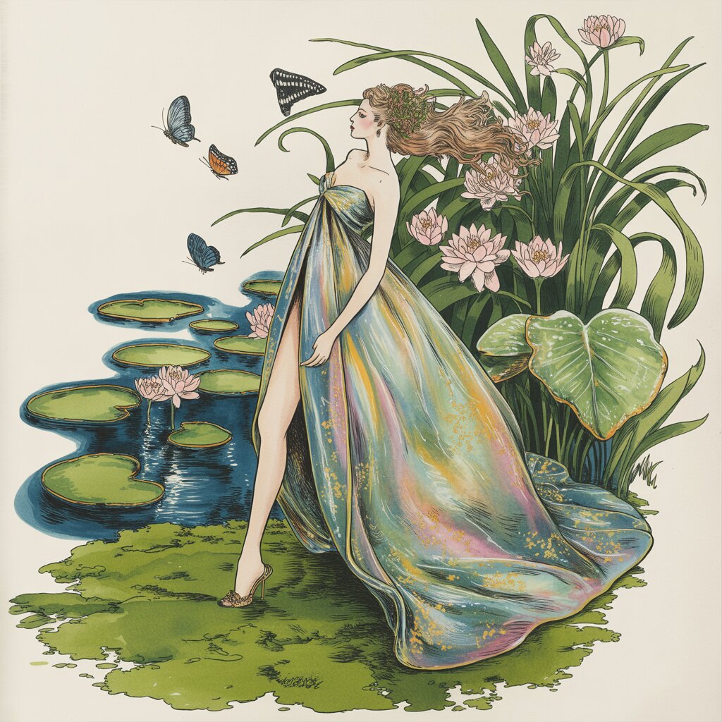
Dior: Jonathan Anderson's Lily Pad
Jonathan Anderson's AW26 show for Dior took place en plein air in the Tuileries Garden, where, as Vogue's Sarah Mower reported, "models traversed a bridge over a water-lily pond, then circled a glasshouse." The collection itself was about lightness and flow: Anderson said he'd "taken all the structure out," treating menswear checks as prints on pleated silk and making coats that wrapped like dressing gowns. The natural setting reinforced the theme of ease and organic movement.
For illustrators, the lesson is about environment as context. When a collection is shown in a garden rather than a white box, the relationship between garment and setting becomes part of the design language. Drawing that relationship, figure among water lilies, fabric catching a breeze, opens up compositional possibilities that studio-shot fashion illustration rarely explores.
The Creature Feature: From Feathers to Rodents
Nature didn't stop at plants. The season also saw designers exploring animal forms and creature-like transformations in their collections. Feathers, furs (both real and faux), and organic textures appeared across multiple shows, blurring the line between human figure and natural world. For illustrators, these transformations present one of the season's most exciting drawing challenges: rendering the moment where a fashion figure becomes something more than human.
Why Nature, Why Now?
Understanding the why behind a trend makes your illustrations smarter, not just prettier.
There are a few possible explanations. In times of political and technological upheaval, fashion has historically oscillated between two responses: confronting reality head-on, or offering an escape into something beautiful. The nature trend at AW26 leaned heavily toward escape. Chanel, Miu Miu, and Dior all built environments that transported their audiences into gardens, forests, and parks, away from the noise of daily life.
Prada herself articulated this impulse at Miu Miu: "Because we are small in the world, but we are enough." That sentiment, grounding oneself in something real and organic amid chaos, resonated across the season.
For your illustrations, this context matters. A nature-inspired fashion illustration can carry different emotional weight depending on whether it reads as escapist fantasy (dreamy, soft, romantic) or as commentary (sharp, surreal, unsettling). A figure in a garden is not the same mood as a figure transforming into a creature. Both are nature. Both are valid illustration subjects. But the rendering approach should reflect the intent.
How to Draw It: Techniques for the Nature Trend
Now the practical part. Here are four illustration challenges this trend presents, and how to solve them.
1. Botanical Textures on Fabric
When flowers and leaves appear as prints, appliqués, or three-dimensional embellishments on garments, you need to render organic softness on structured fabric. The danger is making the botanical elements look like stickers pasted onto the figure.
Technique: Draw the garment silhouette first, then layer botanical elements that follow the fabric's drape lines. A rose on a bias-cut skirt should curve with the fabric's fall, not sit flat. Use a light Prismacolor Col-Erase pencil in light green or rose to sketch the botanical shapes, then refine with a fine-line Sakura Pigma Micron pen (0.25mm or 0.3mm for petal details). The key is making the nature elements obey the garment's gravity.
2. The Metamorphosis Figure
Drawing a figure that is part human, part animal (or part plant) is one of the more challenging illustration exercises. It requires you to transition smoothly between human anatomy and organic forms, whether that means feathered legs, vine-wrapped arms, or a torso dissolving into petals.
Technique: Start with your standard 9-head croquis, lightly drawn. Then identify the "transition zone," the area where human form blends into creature. For feathered feet, this would be the ankle area. Build up feather texture gradually from the shin downward, increasing density and coverage as you go. Use a Staedtler Mars Lumograph pencil (HB for light feathering, 4B for deep shadow areas) and vary your stroke direction to mimic the natural lay of feathers. The human proportions above the transition zone should remain crisp and clean, creating contrast that makes the metamorphosis feel intentional rather than messy.
3. Environmental Composition
This season's sets were as important as the clothes. Moss at Miu Miu, a water lily pond at Dior, and construction cranes at Chanel mean your fashion illustrations could benefit from environmental context, something fashion illustration traditionally avoids in favor of clean white backgrounds.
Technique: Keep the figure rendered at full detail and precision. Render the environment in a looser, more impressionistic style so it doesn't compete with the garment. A wash of green Dr. Ph. Martin's Hydrus watercolor at the figure's feet, blending into the paper at the edges, can suggest a moss-covered floor without overwhelming the illustration. For water lilies or flowers, a few carefully placed shapes in diluted color can frame the figure without stealing focus.
If you work digitally, consider a split-opacity approach: the figure at 100% opacity and the natural environment at 30 to 50%, creating a dreamy layered effect that references the set design without literal reproduction.
4. Iridescence and Color-Shift Fabrics
Chanel's AW26 collection featured iridescent fabrics, what Vogue described as "printed chainmail and trompe l'oeil tweeds," that shift color depending on the light. This is genuinely difficult to capture on paper.
Technique: Layer complementary colors. For a blue-green iridescence, start with a base wash of teal, then add thin strokes of purple and gold on the fabric's highlight areas using Prismacolor Premier colored pencils. Use a colorless blender pencil to smooth the transitions. The trick is working in at least three color families: a dominant tone, a warmer shift color, and a cooler shift color. Your brain reads the combination as "this surface changes," which is exactly what iridescence does. For markers, Tombow Dual Brush Pens allow you to layer and blend colors directly, which works well for looser, more painterly renderings of color-shift fabric.
Beyond the Trends: What Else Moved at AW26
Nature was the dominant theme, but AW26 had other notable moments worth watching for your illustration practice:
Chanel's dropped waistlines: Blazy referenced Coco Chanel's 1920s dropped-waist designs, pushing them to new extremes. As Vogue reported, these "belted drop-waist looks elongated the torso, producing a flapperish, unstructured, and yes, caterpillar-ish" silhouette. If you've been practicing your Art Deco silhouettes (and if you read our guide on drawing the 1920s revival, you have), this is that trend evolving further.
Dior's lightness: Anderson's collection was notable for how far he's moved from his structured debut. Vogue's Mower observed he'd gone from "the fear and neurosis of taking on a brand" to trusting his instincts, "making sense of frothy decorativeness and his own knack for cool simplicity, side by side on the same runway." For illustrators, this mix of structured tailoring and flowing organic shapes is a valuable exercise in contrasting rendering styles within a single figure.
A Practice Exercise
To put all of this together, try this exercise inspired by the AW26 shows:
- Draw a standard 9-head croquis in a walking pose (referencing Miu Miu's mossy runway stride).
- Design a garment that incorporates one botanical element structurally, not as a print. A skirt made of layered petal shapes, a bodice with leaf-like panels, sleeves that taper into vine-like points.
- Add a transition zone where the figure begins to merge with nature. Perhaps the feet disappear into an impressionistic ground wash. Perhaps feathers begin at the wrists.
- Render the fabric in at least two different textures: one structured (the garment's main body) and one organic (the nature elements).
- Frame the composition with one environmental element, a single water lily, a branch of leaves, a butterfly in mid-flight, that echoes the garment without cluttering the page.
Share your results with us on Pinterest. We'd love to see how you interpret the season.
Recommended Supplies for Nature-Inspired Illustration
- Prismacolor Premier 72-Color Set ($74.99) for layering iridescent and botanical color work
- Staedtler Mars Lumograph Pencils ($15.31) for feather textures and fine nature detailing
- Sakura Pigma Micron Set ($12.39) for precise petal and leaf outlines
- Dr. Ph. Martin's Hydrus Watercolors ($49.99) for environmental washes and mossy backgrounds
- Canson XL Mix Media Pad ($17.63) heavyweight enough for layered pencil work plus watercolor washes
Affiliate disclosure: As an Amazon Associate, Croqui Studio earns from qualifying purchases. We only recommend products we'd use ourselves.
Sources
- Phelps, Nicole. "Chanel Fall 2026 Ready-to-Wear." Vogue, March 9, 2026.
- Mower, Sarah. "Miu Miu Fall 2026 Ready-to-Wear." Vogue, March 11, 2026.
- Mower, Sarah. "Christian Dior Fall 2026 Ready-to-Wear." Vogue, March 3, 2026.