How to Draw Prints and Patterns in Fashion Illustration
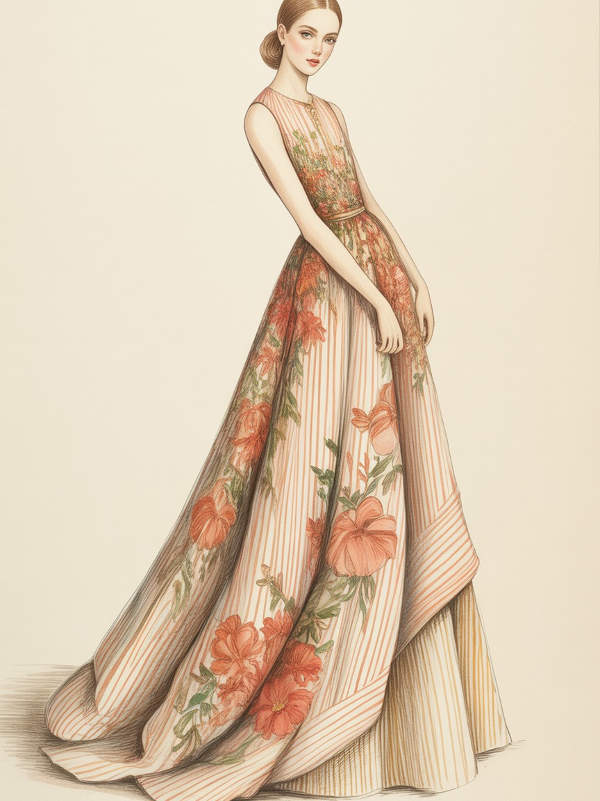
A flat print looks correct. A wrapped print looks alive. That is the entire difference between a beginner's polka-dot dress and a professional's: the beginner draws the dots the same size everywhere, and the professional lets the dots shrink, curve, and disappear into the folds exactly the way real fabric would. Pattern is not decoration you add after the figure is finished. It is information about the form underneath it, and drawing it well is one of the fastest ways to make a croquis look like it belongs in a real collection.
The good news is that wrapping a print convincingly comes down to a small set of repeatable habits, not raw talent. Here is how to build them, print by print.
Why Patterns Break Down: The Flat-Sticker Trap
Almost every beginner draws pattern the same way: finish the figure, then lay stripes or dots on top like a sticker, ignoring the folds and curves already drawn underneath. The result looks pasted on because it is pasted on. The pattern carries no information about where the fabric is close to the body, where it falls away, or where a fold hides part of the motif entirely.
The fix is a mindset shift. Before you draw a single stripe or flower, the folds and the silhouette have to exist first in light pencil. The pattern is the last thing you draw, and its only job is to describe the surface that is already there. If you can see the fold lines under your pattern, you did it in the right order. If the pattern hides every fold, do the folds first.
Stripes: The Best Teacher for Wrapping
Stripes are the easiest print to learn from because a mistake is instantly visible, and that makes them the best warm-up before tackling anything more complex.
- Follow the cross-section, not the garment edge. Imagine slicing the garment like a loaf of bread at each stripe. Each stripe should trace the curve of that slice: it bows outward over the chest or hip and curves inward at the waist, exactly like a contour line on a map.
- Bend stripes at every fold. Where fabric folds, a stripe changes direction sharply, sometimes even doubling back on itself for a half-inch before continuing. A stripe that stays perfectly straight through a fold is the single fastest tell that a pattern was drawn flat.
- Narrow the spacing as the form turns away. Stripes on a sleeve curving behind the arm should compress and get closer together as they approach the side you cannot fully see, just like the boards on a barrel look tighter near its edges.
Practice this on a plain cylinder before you attempt a sleeve: draw a tube, add horizontal stripes, and force yourself to curve and compress them believably. Once a stripe can wrap a cylinder convincingly, it can wrap an arm.
Florals: Scale and Placement Before Detail
Florals fail for a different reason than stripes. The individual flowers are rarely the problem; the scale and placement are. A common beginner error is drawing every flower the same size across the whole garment, which flattens the illustration instantly, since a real floral print shrinks in perspective exactly like anything else does as it recedes.
A repeatable process:
- Block the garment folds and silhouette first, in light pencil, with zero pattern.
- Scatter loose, irregular ovals across the surface to mark where flower clusters will sit. Vary the spacing; a perfectly even grid reads as artificial before a single petal is drawn.
- Shrink the ovals as they move toward the edges of the form, away from the viewer, or into a fold.
- Draw two or three "hero" flowers at full detail near the focal point of the pose, then let the rest simplify into loose petal shapes and color blobs. Not every flower earns the same attention; that restraint is what makes a busy floral read as painterly instead of cluttered.
- Let flowers that cross a fold line bend or interrupt at that fold, the same rule as stripes.
This "hero flowers plus simplified background" approach mirrors how the eye actually reads a floral fabric from a few feet away, and it saves enormous time compared to rendering every bloom in full detail.
Plaids and Checks: Two Grids, Not One
A plaid is really two sets of stripes crossing at an angle, which means it inherits every rule from the stripe section, applied twice. The habit that separates a convincing plaid from a flat one is treating the crossing points as their own small landmarks.
- Draw the vertical set of lines first, wrapping and curving with the form exactly like a single stripe would.
- Add the horizontal set second, and let it curve to match the same surface, which means the horizontals compress near the top of a rounded shoulder and stretch slightly across a flatter plane like the back.
- Mark each intersection where the two sets cross. On a flat plaid these intersections form an even grid; on a wrapped plaid they should visibly warp into a soft diamond or trapezoid shape wherever the fabric curves, tightest at the places furthest from the viewer.
- Skip or interrupt lines at a fold's crease exactly as you would for a single stripe.
Tartan and windowpane checks both follow this same two-grid logic; only the color count and line thickness change. If you can wrap one plaid convincingly, you can wrap any of them.
Polka Dots and Small Repeats: The Perspective Trick
Dots, small geometric repeats, and tiny motifs like stars or hearts all share one property that stripes and plaids do not: they have no inherent direction, so their only wrapping cue is size and spacing. That makes the rule simple to apply and easy to forget under deadline pressure.
Dots should shrink and crowd closer together as the surface turns away from the viewer, and grow larger and more spaced out on the surfaces angled most directly toward the light. A skirt with dots evenly sized from hem to waist looks like a flat swatch laid over a shape. The same skirt with dots that compress near the side seams and open up across the front reads immediately as three-dimensional fabric, even before any shading is added.
Mixing Multiple Prints on One Figure
Pattern mixing is a real technique in fashion, not a mistake, but it needs a hierarchy to avoid visual noise. A dependable rule: pick one dominant print with the largest scale, one supporting print at a noticeably smaller scale, and let every other surface stay solid or textured-but-plain. If two prints compete at the same scale and the same visual weight, the eye cannot settle anywhere and the illustration reads as chaotic rather than curated. This is the same principle behind a strong limited color palette: restraint is what makes a busy choice look intentional.
Rendering the Fabric Underneath the Print
A print does not replace the fabric's own texture; it sits on top of it. A silk floral needs the soft sheen highlights of silk under the flowers, and a wool plaid needs the slightly fuzzed, matte edge of wool along its grid lines. If you have not built that muscle yet, our guide on rendering fabric textures covers the sheen, weight, and edge quality for the five fabric families you will draw most often, and pairing it with pattern work is what pushes an illustration from "nice drawing" to "I can tell exactly what this is made of."
A Ten-Minute Daily Drill
Draw a single plain garment shape (a simple A-line skirt is ideal) five times on one page. Leave the first plain. Add stripes to the second, dots to the third, a plaid to the fourth, and a simple floral to the fifth, applying the wrap rules above to each. Ten minutes, five prints, one shape held constant so you can see, side by side, how differently each pattern behaves around the exact same folds. Repeat this drill weekly and the wrap instinct becomes automatic within a few weeks, the same way the mirrored half-template trick trains flat proportion.
Recommended Supplies for Pattern Work
For Crisp Motif Outlines
Sakura Pigma Micron Set (6 pens) keeps stripe and plaid lines fine and consistent, which matters most right at the fold, where a wobble is the first thing the eye catches.
For Fast, Flat Color Blocking
Copic Sketch Markers (72-color set) lay down the even color fields a print needs before the linework goes on top, and their numbered system makes a repeat color easy to match across the page.
For Blending Petals and Fold Shadow
Prismacolor Premier Colored Pencils (72-set) soften the transition between a pattern and the shadow of a fold, so the print looks wrapped instead of printed on top of a flat shape.
For Paper That Survives Repeats
Canson XL Mix Media Pad holds up to the layered marker and pencil passes a busy print needs without buckling or muddying the color.
Practice Pattern Wrapping on a Ready Figure
Our Fashion Croquis Template Sketchbook: Paris Edition gives you 300 pages of light grey 9-head figure templates with scenic Paris backgrounds. Skip redrawing the pose and spend your practice time where it counts: making the print wrap.
Get the Paris EditionSome links above are affiliate links. If you purchase through them, we may earn a small commission at no extra cost to you. We only recommend products we genuinely use or believe in.