How to Draw Rococo Fashion: Panniers, Bodices, and Ornamental Detail
The Rococo period (roughly 1730 to 1780) produced some of the most extravagant garments in Western fashion history. For fashion illustrators, these silhouettes are a masterclass in structure, ornamentation, and fabric rendering. Whether you are studying historical costume or looking for inspiration to push your contemporary illustration work in a more decorative direction, knowing how to draw Rococo fashion will stretch your skills in ways that minimalist modern silhouettes simply cannot.
Why Rococo Matters for Fashion Illustrators
If you have spent most of your drawing time on column dresses, oversized blazers, and straight-leg trousers, Rococo garments demand a fundamentally different approach. The silhouettes are architectural. The surfaces are densely decorated. The palette is deliberate and specific. Drawing Rococo fashion well requires you to think about structure, detail, and color simultaneously, which is exactly the kind of multi-layered rendering that separates intermediate illustrators from advanced ones.
The painters who documented this era, including Jean-Antoine Watteau, Francois Boucher, and Jean-Honore Fragonard, remain some of the most studied artists in fashion illustration programs. Their treatment of draped fabric, light on silk, and cascading decorative detail is essentially a free education in textile rendering. If you have never spent time studying their work, it is worth an afternoon at your local museum or a deep dive through the collections at the Metropolitan Museum of Art's Heilbrunn Timeline of Art History.
Rococo elements also cycle back into contemporary fashion regularly. Designers periodically draw on 18th-century references, from exaggerated hip structures to ornamental embroidery. Understanding the historical originals helps you recognize and illustrate these modern interpretations with accuracy.
A Quick History: What Made Rococo Fashion Rococo
The Rococo emerged in early 18th-century France as a reaction against the heavy symmetry of Baroque design. Where Baroque was grand, formal, and imposing, Rococo was playful, ornamental, and deliberately asymmetrical. In fashion, this meant garments that prioritized surface beauty and structural drama over simplicity.
The key elements you need to understand before you start drawing:
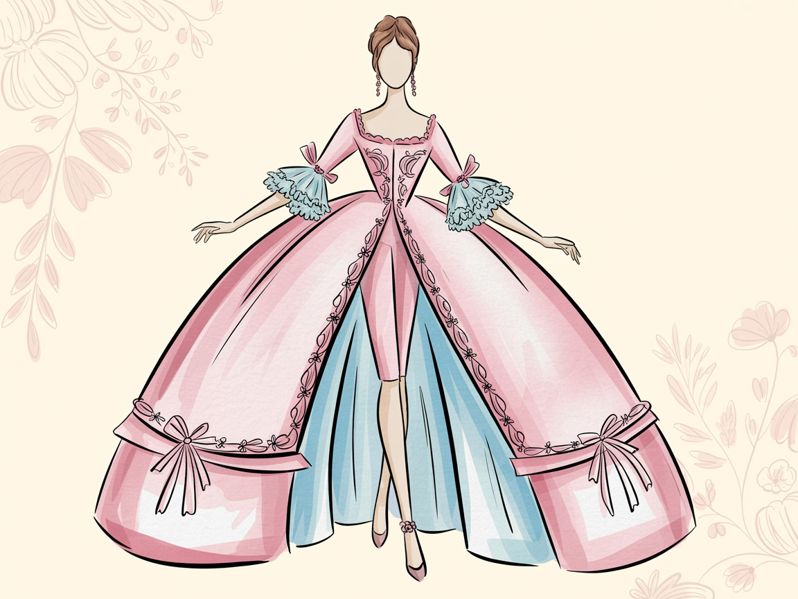
- Panniers: Side hoops that extended the hips dramatically, sometimes to widths of several feet. The silhouette was wide at the hips but flat front-to-back, creating a shape unlike anything in modern fashion. At their most extreme (for court dress), panniers could extend three feet on each side.
- Rigid bodices (stays): Tightly boned corsets that created a conical torso, flattening the bust and tapering to a sharp point at the waist. The posture was upright and formal, with the shoulders pulled back.
- The robe a la francaise: The signature garment of the period. It consisted of an overskirt with distinctive back pleats (Watteau pleats) falling from the shoulders, an underskirt (jupon) visible at the front, and a decorated front panel called a stomacher.
- Elaborate textiles: Brocade, silk taffeta, damask, and chinoiserie prints. Fabrics were embroidered with floral motifs, metallic threads, and ribbon work. The surface of the garment was as important as its shape.
- Ruffles and trim: Layers of lace at the sleeves (called engageantes), ruched ribbon along bodice edges, and cascading fabric flowers. Decoration was applied to nearly every visible surface.
- Pastel palettes: Soft pinks, powder blues, mint greens, and champagne golds. The Rococo color sensibility was light, airy, and deliberately delicate.
Drawing the Rococo Silhouette
The Exaggerated Hip (Panniers)
On the standard 9-head fashion croquis, the hips sit at approximately head 4.5 to 5. In a pannier-inspired look, those hips do not just curve outward. They extend horizontally, sometimes doubling the width of the natural body.
How to approach it: Start with your standard figure, then draw light construction lines extending horizontally from the hip on both sides. The pannier shape is roughly rectangular when viewed from the front, with rounded corners. The fabric drops vertically from the outermost point of the hip extension. Keep the front-to-back dimension narrow. This flatness is what makes the silhouette distinctive and challenging. If you are working in three-quarter view, the pannier reads as a wide oval rather than a circle.
Common mistake: Drawing the hips as a natural curve that just happens to be wider. A pannier creates a hard, architectural break from the waist. There is a visible shelf where the structure begins. Practice this transition by drawing the waist as a narrow inverted triangle, then the pannier as a separate, wider geometric shape attached at the hip.
The Conical Bodice
Modern bodices tend to follow the body's natural curves. An 18th-century stays-inspired bodice does the opposite: it imposes a rigid, geometric shape onto the torso. The line from shoulder to waist is nearly straight, tapering to a pronounced point at the center front waist.
How to approach it: Draw a narrow inverted triangle from the shoulders to a point just below the natural waistline. The bust is flattened rather than emphasized. The neckline is typically wide and low (a square or slightly rounded decolletage). The shoulder line extends slightly beyond the natural shoulder, and sleeves often begin at mid-upper-arm rather than at the shoulder point. This offset sleeve placement gives the bodice a structured, almost architectural quality that reads very differently from a modern fitted top.
Layered Skirts and Volume
A complete robe a la francaise includes multiple visible layers: the underskirt, the overskirt with its back pleats, the stomacher panel, and often additional petticoats for shape. For illustrators, this means drawing garments that have visible depth and dimension.
How to suggest layers: Use overlapping lines to show where one fabric layer ends and another begins. Draw the visible edge of the underskirt peeking below the parted overskirt. Show the stomacher as a distinct panel with different decorative treatment from the bodice sides. Use value changes (lighter and darker tones) to separate layers visually, even in a pure line drawing. The key is making the viewer understand that these are distinct pieces of fabric sitting on top of each other, not a single garment.
Rendering Rococo Details
This is where the real skill development happens. Rococo garments are densely decorated, and learning to render these details teaches you techniques that transfer directly to illustrating modern embellished fashion.
Embroidery and Beadwork
Floral embroidery was the signature decoration of Rococo garments. You do not need to draw every stitch. Instead, focus on suggesting the pattern through selective rendering.
Technique: Lightly sketch the overall embroidery motif (typically scrolling floral vines). Then render a small section in full detail, roughly 15 to 20 percent of the total area. Let the remaining area be suggested with lighter, more gestural marks. The viewer's eye fills in the rest. This selective rendering approach is actually visible in the work of the Rococo painters themselves. In many of Watteau's paintings, fabric details are fully realized in the focal area and merely hinted at elsewhere.
Tools that work well: Fine-tip pens (Sakura Pigma Micron, 0.1mm to 0.3mm) are ideal for embroidery detail. Pair them with a broader marker or pencil for the underlying fabric. The contrast between fine embroidery lines and softer fabric rendering creates visual richness without requiring you to draw every element at the same level of detail.
Lace and Ruffles
Ruffles, lace trim, and cascading fabric details are everywhere in Rococo fashion. Drawing convincing ruffles is one of the more challenging illustration skills, but it becomes intuitive with practice.
Technique for ruffles: Think of each ruffle as a ribbon that alternates between showing its top surface and its underside. Draw a wavy line for the top edge. Below it, draw short curved lines dropping down from the peaks of the wave (these are the folds falling toward you). Add shadow in the valleys between peaks. The rhythm should be slightly irregular. Perfectly even ruffles look mechanical, not luxurious.
Technique for lace: Lace is essentially negative space with structure. Draw the outer silhouette of the lace element (a cuff, a collar, a trim edge). Then, within that silhouette, draw a loose network of organic shapes, leaving white space between them. Do not try to replicate actual lace patterns. Instead, suggest the delicacy with varied line weights: heavier outlines for the lace border, lighter interior details for the pattern.
Brocade and Damask Patterns
Rococo fabrics featured woven patterns, often with a matte-on-sheen contrast. Illustrating brocade requires suggesting a pattern that sits within the fabric rather than on top of it.
Technique: First, render the base fabric with your chosen medium (marker, watercolor, colored pencil). Then, with a slightly lighter or slightly darker value of the same hue, draw the brocade motif on top. The key is subtlety. The pattern should be visible but not overpowering. For a damask effect, use the same color in two different finishes: one matte, one with a slight sheen. A touch of white gel pen or light colored pencil applied over dried marker can simulate this sheen contrast effectively.
Bows and Ribbon Work
Bows are a signature Rococo detail that appears on bodices, at the waist, and as trim along the front of the stomacher (a decorative ladder of bows called an echelle). Drawing them well requires understanding their three-dimensional structure.
Technique: A bow is two loops and two tails. Draw the center knot first as a small, tight shape. Each loop extends outward and curves back toward the center. The key is to show the ribbon twisting as it forms the loop: draw the outer edge as a smooth curve, then the inner edge (where it folds back) as a parallel curve that narrows toward the knot. Add a cast shadow beneath the bow to lift it off the garment surface. For the tails, let them fall with a gentle S-curve rather than hanging straight down.
Color: Thinking Like Boucher
Francois Boucher, the official court painter to Louis XV, established what we now recognize as the definitive Rococo color palette. His paintings of Madame de Pompadour and pastoral scenes use a consistent range of soft, warm pastels grounded by metallic accents:
- Rose pink: Not hot pink, not blush. A medium-saturation pink with warmth. Think of the color of a fully opened garden rose.
- Powder blue: Cool, dusty, and light. The quintessential Rococo blue, visible in everything from court dresses to porcelain.
- Sage and mint greens: Muted, never bright. Often paired with gold trim or embroidery.
- Champagne and gold: Used for highlights, metallic trim, and embroidery accents. The warm metallics ground the cool pastels.
- Cream and ivory: The base tones. Rococo fashion rarely used pure white. Everything was warmed slightly.
If you work with Prismacolor Premier colored pencils, look for Deco Pink, Cloud Blue, Celadon Green, and Cream as your Rococo starter set. For markers, Copic's R81 (Rose Pink), B41 (Powder Blue), YG61 (Pale Moss), and E51 (Milky White) make an excellent base layer, with Y21 (Buttercup Yellow) or E33 (Sand) for warm metallics.
Practice Exercise: Drawing a Robe a la Francaise
Here is a focused exercise that covers the major challenges of Rococo illustration:
- Draw your standard 9-head croquis. Keep the pose relatively frontal. A slight contrapposto is fine, but avoid extreme movement. Rococo garments are structured, and the pose should let the clothes be the focus.
- Block in the pannier silhouette. Extend the hips outward with construction lines. Draw the waist-to-hip transition as a visible architectural break, not a smooth curve.
- Add the bodice. Draw the conical shape: wide at the shoulders, tapering to a point at the low waist. Keep the neckline wide and low. Add short puffed sleeves ending at the upper arm, with lace cuffs (engageantes) falling from the elbow.
- Layer the skirts. Draw the overskirt parting at the front to reveal the underskirt. Give each layer a different decorative treatment: the overskirt might be plain silk, the underskirt brocade or embroidered.
- Add the stomacher. Draw the triangular front panel with a ladder of small bows (the echelle). This detail alone will make the garment read as authentically 18th-century.
- Render one area of embroidery in full detail. Choose a section of the underskirt. Sketch a scrolling floral motif, then render it with fine-line detail. Let the rest of the fabric be suggested with lighter marks.
- Apply a Boucher palette. Use the colors listed above. Start with the lightest values and build up. Reserve the gold/champagne tones for trim and metallic accents.
This exercise covers exaggerated silhouettes, rigid structure, layered garments, decorative detail, and period-appropriate color. Once you feel comfortable with the historical version, try a hybrid: a Rococo bodice with modern jeans, or pannier-width hips on a streetwear look. That tension between historical structure and contemporary context is where some of the most interesting fashion illustration happens.
Recommended Supplies
The level of detail in Rococo-inspired work demands tools that can handle both broad fabric rendering and fine decorative lines:
- Sakura Pigma Micron Set for embroidery and lace details. The 005 (0.20mm) and 01 (0.25mm) tips handle fine decorative work beautifully.
- Staedtler Mars Lumograph Pencils for initial construction and shading. The range from 2H (construction lines) to 4B (fabric fold shadows) covers everything you need.
- Prismacolor Premier Colored Pencils (72-set) for the full Rococo palette. The wax-based formula layers smoothly, which matters when building up brocade patterns and embroidery gradients.
- Canson XL Mixed Media Pad handles both wet and dry media, essential if you are combining marker rendering with fine-line pen detail.
Further Study
For visual reference, these resources are worth your time:
- The Metropolitan Museum of Art's Costume Institute: Their online collection includes hundreds of 18th-century garments photographed in detail. Search "robe a la francaise" or "18th century dress" in their collection database.
- The Victoria and Albert Museum: Their fashion collection includes well-documented Rococo pieces with close-up photography of textile details.
- Boucher's paintings: Study "Madame de Pompadour" (1756, Alte Pinakothek, Munich) and "The Toilet of Venus" (1751, Metropolitan Museum of Art) for his fabric rendering and color palette.
- Watteau's "fetes galantes": His paintings of aristocratic outdoor gatherings are essentially fashion illustration before the discipline existed. Pay attention to how he suggests fabric texture with minimal brushstrokes.
The Rococo was, at its heart, a rebellion against austerity. Three hundred years later, its techniques for rendering extravagant garments remain some of the most useful skills a fashion illustrator can develop. Pick up your pens and give it a try.
Looking for croquis templates to practice on? Our Fashion Croquis Template Sketchbook: Paris Edition features 9-head figures on scenic Parisian backgrounds, perfect for exploring period-inspired fashion illustration.
Disclosure: As an Amazon Associate, Croqui Studio earns from qualifying purchases. Product links above are affiliate links. We only recommend supplies we genuinely believe improve your work.